You have several options to optimize the mobile view of your maps. In this article you will learn how the different templates can be adapted and how the individual changes affect other device views.
Mobile view of the Folding Card 2.0
There are a total of three adjustment options for the folding card, each of which has a different effect on the mobile display.
Tip: The options now listed can be used both individually and in combination.
Adjust the folding upwards
The first option is to change the folding direction. It ensures that your card opens upwards and not to the side.
To do this, open the editing mode of your desired eCard. Then click on ECARD SETTINGS > eCard Behaviour. In the Folding Direction item, you can now select To the Top.
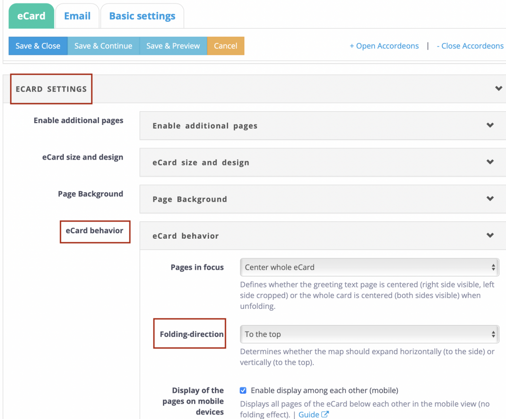
The full display of the two inner sides of your eCard has now been optimized.
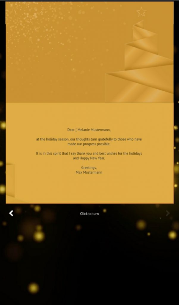
(The image below shows the mobile view of the folding card).
Centre whole eCard
Centre the whole map. The next option is to change the centring of the card. It ensures that the whole card is focused when unfolded and not just the greeting text.
To do this, open the editing mode of your desired eCard. Then click on ECARD SETTINGS > eCard Behaviour. In the item Pages in focus you can now select Center whole card.
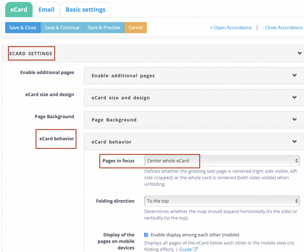
Now your folding card is also fully displayed when unfolded to the side.
(The image below shows the mobile view of the folding card).

Enable mobile display of pages below each other
Another option is to activate the display below each other. It was developed especially for the display of the pages on mobile devices and ensures that the individual card pages are displayed one below the other.
To do this, open the editing mode of your desired eCard. Then click on ECARD SETTINGS > eCard Behaviour. In the item Display of pages on mobile devices, you can now select Enable display among each other (mobile).
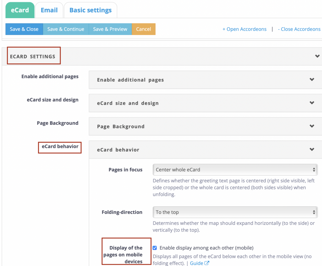
The full display of your card content has now been specially adapted for mobile devices. For all other end devices, your original settings for eCard behaviour continue to apply.
(The image below shows the mobile view of the folding card).

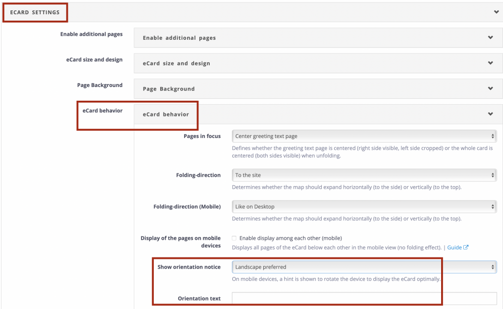
Show orientation notice
If none of the previously displayed functions meet the requirements, the original eCard display can be kept and a hint to turn the mobile device can be displayed. This hint, which you define, is only displayed on mobile devices.
To implement, please open the edit mode of your desired eCard. Then click on ECARD SETTINGS > eCard Behaviour. In the item Show orientation notice, you can now select Portrait or Landscape as the orientation of the note.
In the Orientation text field, you can set the content of the notice. Then save the changes.
Mobile view of the Flip Card and Altar Folding Card (Gatefold)
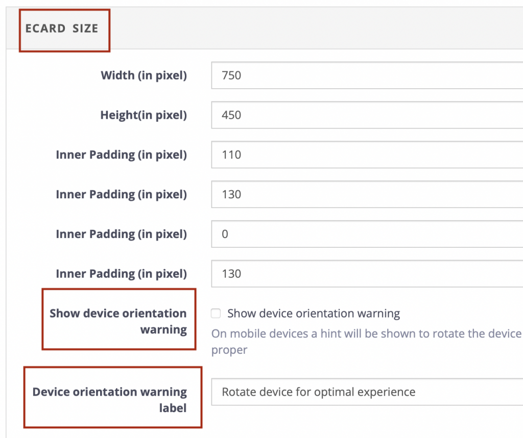
If the width of the flip card or altar folding card is an obstacle, a note can be left for the receivers using a mobile device. This prompts them to turn the device horizontally to ensure optimal mobile display.
Go to the editing mode of your eCard to activate the hint. You can now tick the checkbox under eCard Size > Show device orientation warning.
In addition, you can specify the exact text of the note in the field Device orientation warning label below.
Mobile view of the Newsflash
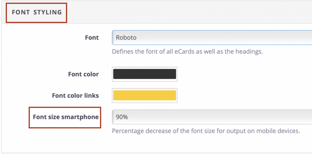
If your Newsflash reader uses a mobile device, you can adjust the text size accordingly to increase the readability of your content..
To do this, go to the editing mode of your Newsflash. Under Font Styling > Font size smartphone you now have the option of specifying a percentage to reduce the font size on mobile devices.
Example: If you enter 50%, your original text size will be reduced by 50% for the mobile view.
Mobile view of the Feedback Template (Survey)
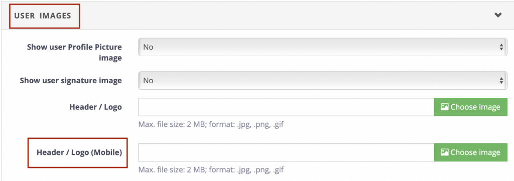
With regard to the feedback template, you have the option of uploading a header or logo that is optimized for mobile devices.
This is done in the editing mode of your respective feedback template under User Images > Header/Logo (Mobile).